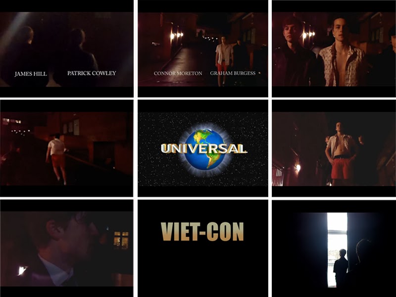
Screenshot 1 is a mid-two shot that shows two characters (James Hill & Patrick Cowley) walking towards an alley where the main scene will happen. The titles underneath the characters allow the audience to know who they are. We used a dark alleyway to set the scene as it connotes a dark and mysterious background. We used low lighting to add a sinister theme but we were also aided by the light from the houses opposite us which added some light to area which we used to our advantage by positioning the characters in the light. The mise-en-scene of this scene is interesting because you get to see the main antagonist wearing a black suit-this connotes that he is intelligent and is not easily outsmarted which follows the traditional codes and conventions of an action villain.
Screenshot 2 is a mid-shot that shows another two characters (Connor Moreton & Graham Burgess) walking towards James and Patrick. The audience are wondering what is happening and are started to ask questions. The mise-en-scene of the characters Connor (main protagonist) and Graham (James's henchman) allows the audience to see the clear binary opposition between the heroes and villains. The main protagonist (Connor Moreton) wears an open Hawaiian shirt-this suggests that he has just been on holiday and is quite casual. The white clothing connotes that Connor is a hero, however it could also mean that he is surrendering (but we left this for the audience to decide and to keep them thinking). Graham (James's henchman) is wearing black; he is trying to be discrete and not seen. The black clothing also connotes evil and darkness which indicates to the audience who the characters are and which side they are on.
Screenshot 3 is a mid-shot that shows the two henchmen (Patrick Cowley & Graham Burgess) with the main protagonist between them (Connor Moreton). This suggests that Connor has been taken to meet with James but not by choice and again shows the binary opposition between the heroes and villains. This creates more and more enigmas (which are exactly what we wanted) and keeps the audience on their toes.
Screenshot 4 is a long shot that shows the start to the chase scene with Connor sprinting away with Patrick in pursuit. This indicates the genre to the audience allowing them to know what else is to come. Our film did follow the typical conventions of an action film with a chase scene leading to a final confrontation but with a twist. The lighting of this scene worked to perfection as we adjusted it through the use of editing to highlight Connor and make him the centre of the scene, this shows that this is his moment in the film and also suggests that he is getting away easily as Patrick has been blacked out.
Screenshot 5 shows our institution. We chose universal because we believed that they suited our film best and we knew that they can make any low budget film a success. They also have had great success with action films, such as "The Fast And Furious" and "Inglorious Bastards" with "The Fast And Furious" making about $207,283,925 (Worldwide) and "Inglorious Bastards" making about $313,600,000 (Worldwide). This shows that Universal are successful in creating action films and distributing them making them the perfect institution for our film.
Screenshot 6 is a low angle shot that shows the two henchmen with the main protagonist between them. We used our editing skills to highlight Connor and make him look superior to the others with the camera aimed directly at him from a low angle- this makes him look more important compared to the other characters. It also shows Connor a little closer with the two henchman a little behind him-this was to show dominance and make it look like the henchman are ready just in case Connor tries to try anything.
Screenshot 7 is a close up shot of James Hill (the main antagonist) exchanging a bit of dialogue with Connor. We first used torches from our phones to add lighting to James because it was very dark, however when it came to editing this proved to be aggravating; it meant that I couldn't highlight only James or get rid of the lighting already on him. It didn't seem to be too bad in this scene but it did become a problem for the later scenes.
Screenshot 8 shows the title of our film. It has gold text in bold on a black background-this makes it easily seen and catches the eye of our audience. A film that has similar titles to us is "James Bond Goldeneye" which has gold text on a black background-this influenced our decision as we knew the titles from James Bond were iconic and popular with the audience.
Screenshot 9 is an over the shoulder shot showing two characters exchanging a few lines of dialogue. The scene is blacked to create enigmas and make the audience wonder who the characters are. The scene first fades in and then a few lines are said before it fades out with the dialogue continuing over the scene-this suggests it’s a flashback and a bit of a back story for the characters and helps the audience to understand the situation that happens later.
No comments:
Post a Comment